Hello, I’m Joen. I design and develop interfaces for Automattic & WordPress.
Below is a selection of work I’ve done.
-
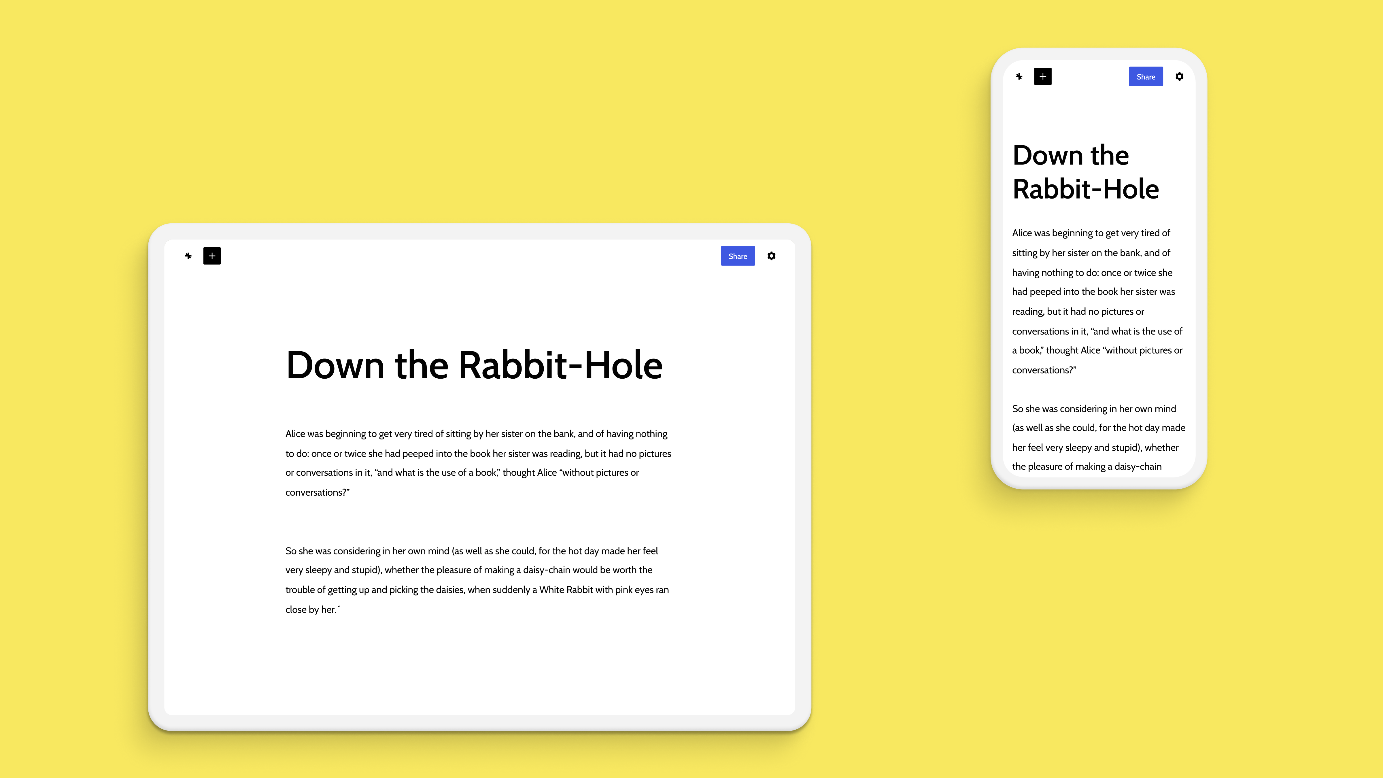
Scrive
-
Fálame
-
Advice to My Younger Self
-
Concept.
Dots & Arrows
Early unfinished sketches for a Jetpack design exploration.
Dots & Arrows
-
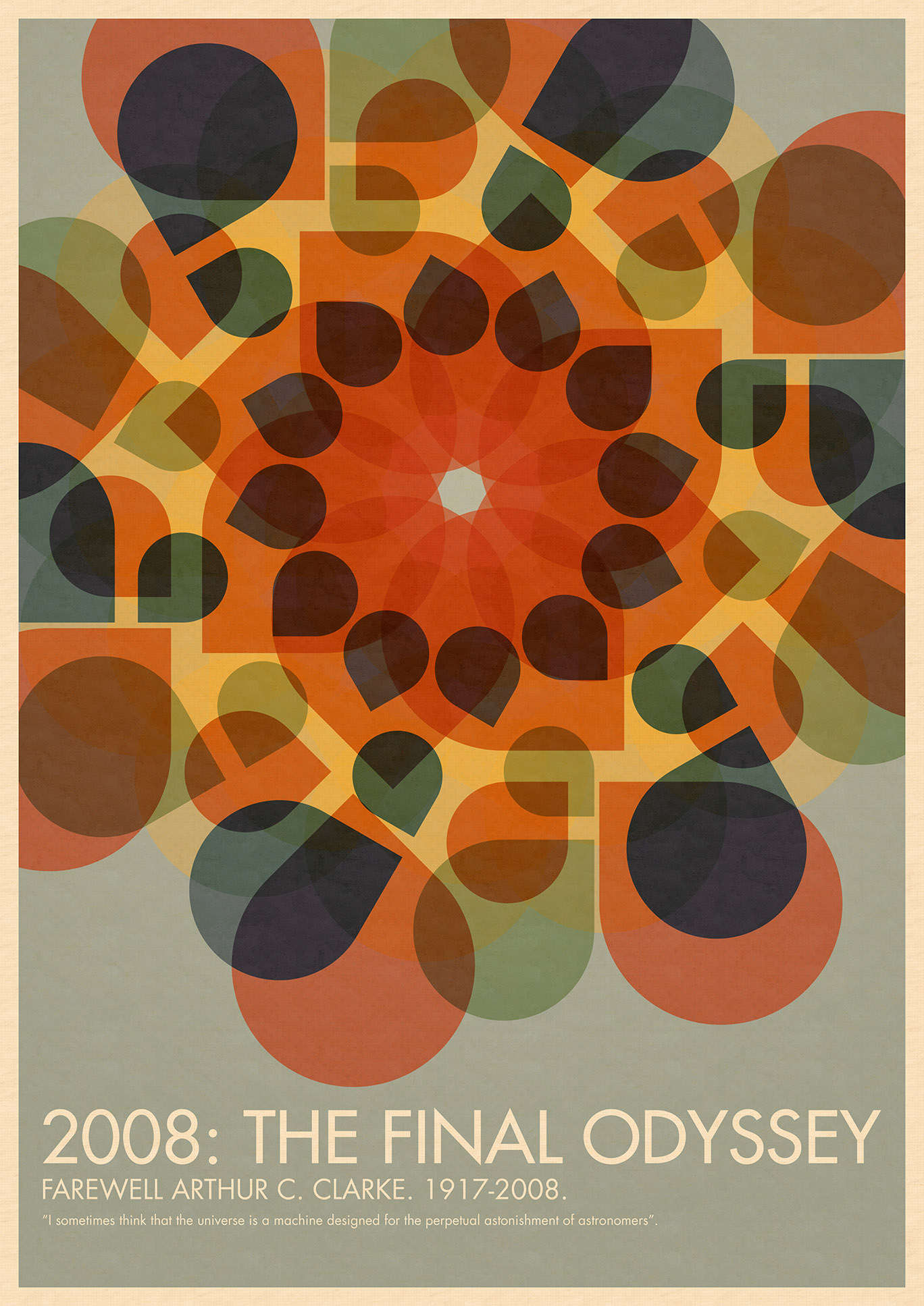
Arthur C. Clarke, 1917-2008
-

Douglas Adams, 1952-2001
-

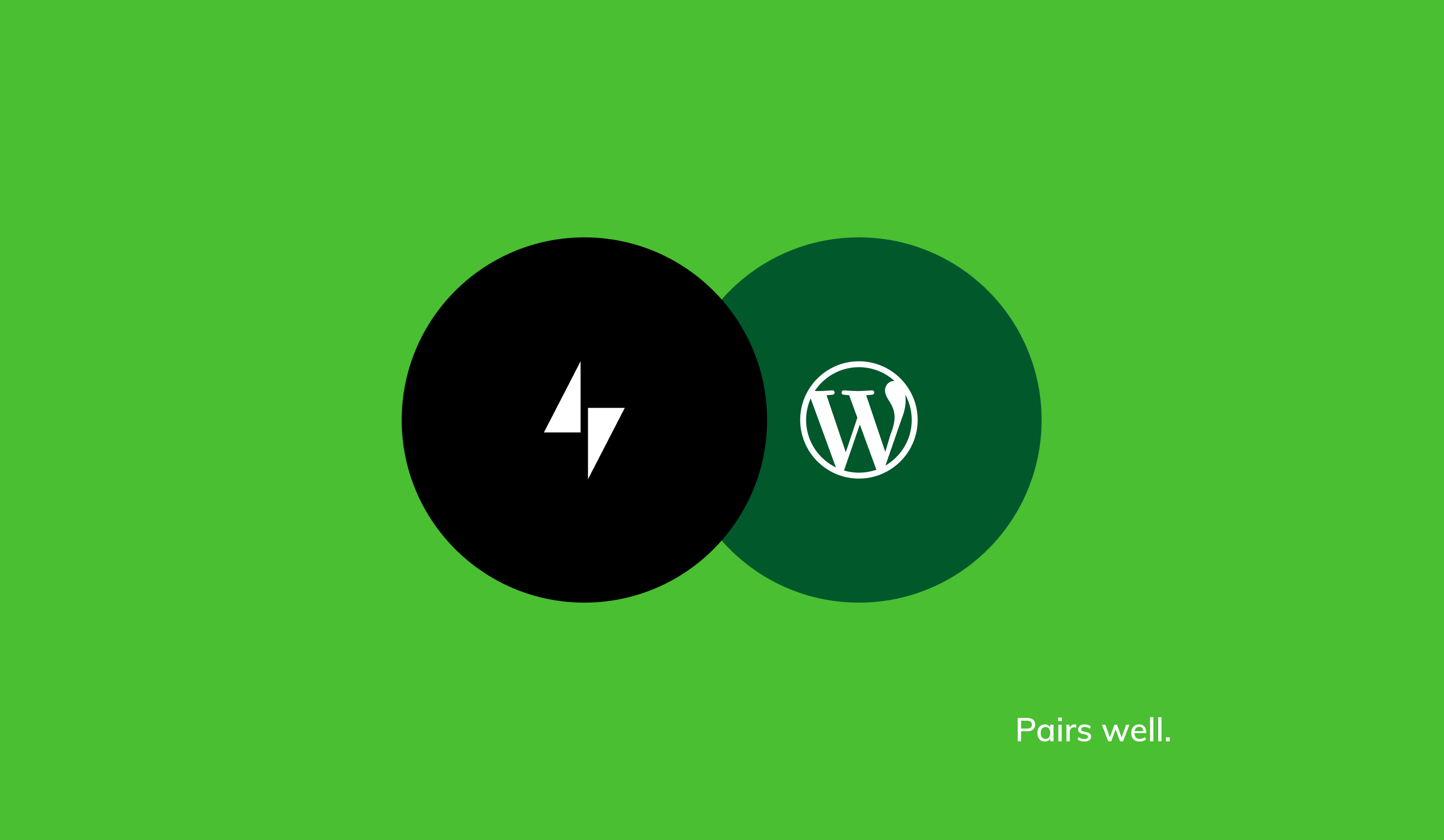
Peel
-

Via
-
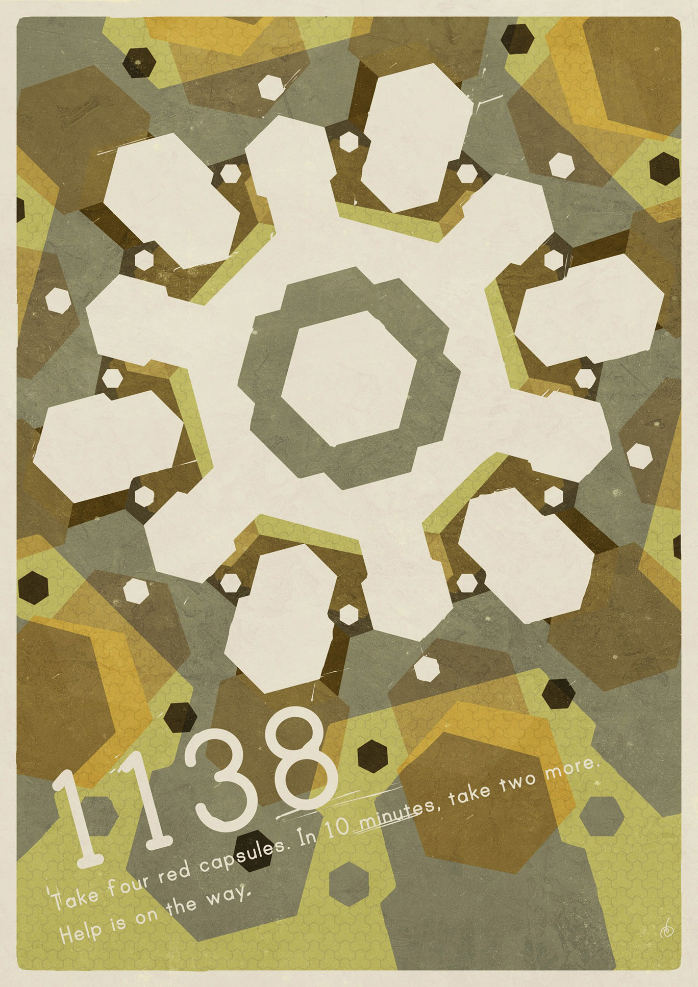
Take Four Red Capsules
-

An Evening In Sweden